

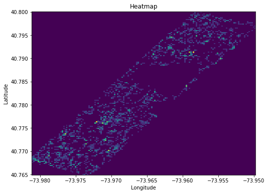
In recording the sightings, census takers noted the precise latitude and longitude the squirrels were spotted at (or perhaps rather where the observer was located). This is a heatmap of that data, or more specifically, a 2D-histogram. Brighter regions of course indicate that there were many spottings in a close vicinity to the location, and darker indicate there were few or none. I think it's fascinating that just from a handful of squirrel spottings, we can clearly make out where the lakes and buildings are, as no squirrels can be spotted there.
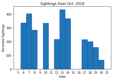
A bar plot of the number of recorder sightings over the month the census took place. Interesting to note that on the 13th, over 400 sightings were recorded! This sort of data is useful in examining possible biases in the analysis of the data. If, for example, sightings were only recorded on a specific day of the week, they could be influenced by regular traffic events - for example the park is probably busier on a Saturday than a Monday, and this could influence how/when squirrels are spotted and what they're doing.
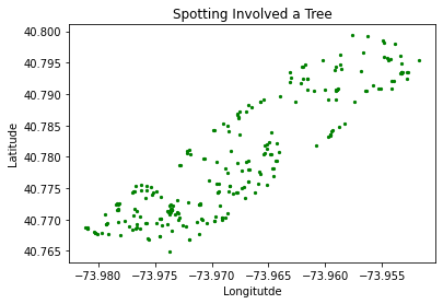
Here I've made a scatterplot of the latitude and longitude of all squirrel sightings in which the census taker included the words "tree" in their extra notes (including variants like "trees", "Tree", etc.). It's not particularly interesting for this particular dataset, as it communicates relatively the same information as the heatmap, but with different animals or different study area, or a much larger data set, filtering notes like this could be more informative as it could show us how tree density relates to where the animal spends its time, locational preference, or just help to understand the arragement and density of different flora.
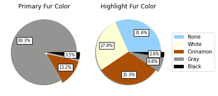
Pie charts showing relative proportions of primary (main) and secondary (highlight) fur colours. This sort of analysis is useful in studies involving genetic information, as the phenotype reflects the allele variation. This could possibly be of interest especially when paired with notes from the census takers on behaviour, particularly if observed over longer periods of time. For example, certain colours might be harder for dogs to spot but easier for cats or vice versa.
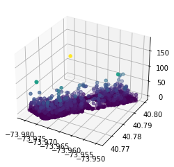
Another take on the latitude/longitude plot, but this time a scatterplot where the data points are moved and coloured according to the height the squirrel was spotted at. It's not really for picking out invidivual spotting heights, but rather to see a heightmap of the landscape, showing us where the tallest trees (presumably) are, and also making obvious that the vast vast majority of squirrels were spotted on the ground or very close.
